In-depth analysis: Is the current price range the springboard for the main upward trend of this cycle?
Original author: Mur phy (X: @Murphychen 888 )
Preface
Since I wrote the article Using the Gods Perspective to Discover the Inner Operating Laws of BTC in February this year, I have not written any long tweets. On the one hand, I think that if I can explあいn the simple logic clearly, I dont need to use long articles to increase the readers fatigue. On the other hand, my busy work makes it impossible for me to calmly think about a complete set of data systems. In particular, I like to express my articles clearly with pictures and texts; sometimes the time spent on drawing pictures even exceeds the time spent on typing.
Recently, I often receive private messages from friends asking me to talk about the current stage of the bull market and verify it with on-chain data. In fact, many excellent data analysts have analyzed this. For example, Ni Da @Phyrex_Ni described the most realistic data fundamentals in his article on June 11, combining macro events, on-chain structure, and exchange inventory. The link is as follows: https://x.com/Phyrex_Ni/status/1800210944188190983…
However, I still hope to express some of my personal opinions from different perspectives than what everyone usually sees. After a long period of thinking, I finally finished this article of nearly 3,500 words after two days of writing, drawing, annotating and proofreading. If you are a BTC holder or a trend trader, I believe that after reading the full article, it can provide you with some different references and ideas.
Without further ado, lets get to the point…
text
The chip structure on the URPD chain can serve as an extremely important reference for trend judgment. It is different from the technical theories we commonly use, such as K-line, volume price, moving average, etc. Instead, it uses the dense area formed by the movement of chips on the chain to observe who is buying (willingness to buy) and who is selling (selling risk), so as to predict which direction the market may move in the next time.
A chip-dense area formed by long-term turnover is often the springboard for the next stage. The stronger the chip structure (thickness), the wider the price span (width), and the greater the probability of upward 発達. Thickness means that there is a strong willingness to buy in this range, which can take over the distribution of chips in other low-cost ranges, and due to high expectations for the future, the selling risk generated when prices fluctuate will also be low. Width means that the chips are well dispersed and will not generate concentrated selling pressure. As long as there is no sudden black swan event, the chip-dense area will form a resistance and stickiness effect on the price, that is, it is not very sensitive to prices and is not easy to be penetrated.
Throughout this cycle, there are two impressive “springboards”:
A. US$25,000-30,000;
B. $41,000-44,000.
The formation of range A took 220 days from March 23 to October 23, and the formation of range B took 67 days from December 23 to February 24. Therefore, we can see that the formation of a thick price range must be based on months. During this period, both long and short sides need to experience fierce confrontations before they can finally reach a consensus on the bottom.
The following figure shows the URPD data on October 15, 2023. After 220 days of turnover, 467w BTC were accumulated in the range of 25,000-30,000 USD, accounting for 24% of the total #BTC circulation at that time. It can be said that this is a very exaggerated data of a huge scale. Almost all the selling risks have been released here, and the next jump is a natural result.
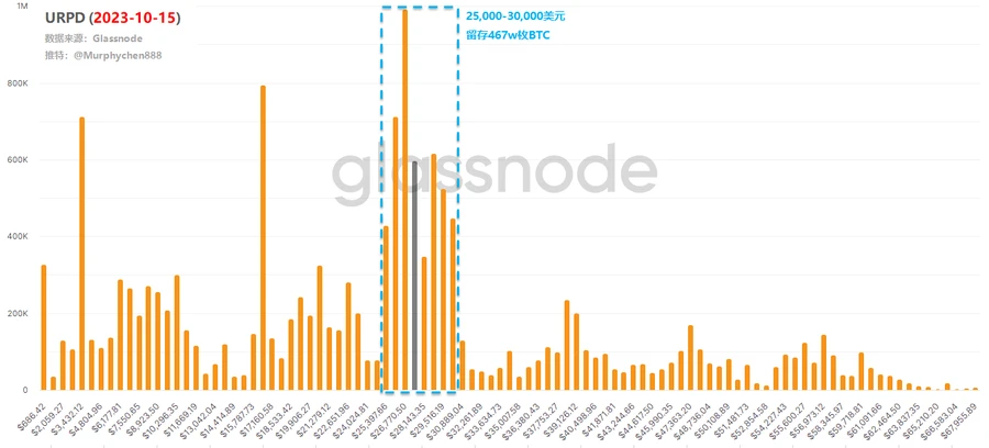
On January 6, 2024, the eve of the approval of the spot ETF, BTC formed a pile of 2 million BTC at $41,000-44,000 after 67 days of turnover. Among them, 169 million BTC were transferred from the A range (i.e., the 25,000-30,000 range). This is a process of exchanging low-priced chips for high-priced chips, allowing short-term chips that trade ETFs with positive expectations to get off the train in advance.

At the same time, there are still 298w chips with firm belief in the A range. This is also the important reason why BTC fell back from 46,000 to 38,000 after the ETF was passed, but did not continue to fall back to the A range. Almost all the chips that can move are in these two ranges. The chips in the low range do not want to be sold, and the chips in the high range are reluctant to be sold , which naturally creates conditions for another jump.
At present, the on-chain chip structure is quietly forming the C range!
This is a large range from 60,000 to 70,000 USD, which includes two smaller ranges, namely 60,000-64,000 USD and 66,000-70,000 USD. For the sake of convenience, we will temporarily call them C1 and C2 ranges.

As of June 11, 108w chips were accumulated in the C1 interval and 189w chips were accumulated in the C2 interval (please ignore the chip movement of Mt.Gox here). Among them, 103w chips were transferred from the A interval and 97w chips were transferred from the B interval. From the perspective of time span, this process lasted 104 days ( the condition of month as a unit has been met ).
If you ask me how long it will take to accumulate, I dont know. But according to the data from the previous times, theoretically, as a springboard, it should not need a price span as wide as 10,000 US dollars (5,000 US dollars is enough). Therefore, both C1 and C2 are likely to become the bottom ranges for consensus in the future. If it is C1, then we have to wait for the chips of C2 to be gradually digested and slowly transferred to C1 to continue to form a more solid range structure. Or a new accumulation area is formed between C1 and C2.
Of course, this alone is not enough…
To become the springboard for the next stage, another important condition must be met, namely, the chips in the low zone do not want to be sold, and the chips in the high zone do not want to be cut off . We can use several other sets of data to see whether the current situation meets the requirements.
1. Has the seller’s risk been released?
The realized profit and loss data chart can clearly show the total amount of BTCs realized profit and realized loss every day, and its relative size can better understand the market cycle and investor sentiment.
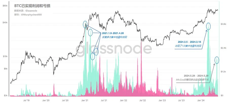
Realized profits (RP, green bars) tend to dominate during bull markets, as low-cost chips continue to enter and cash out as the market strengthens. Realized losses (RL, red bars) tend to dominate during bear markets, as BTC purchased at high prices exit at a loss, especially peaking at market capitulation events (i.e. bear market bottoms).
During the peak period of the last bull market, from January 9, 2021 to April 20, 2021, the RP value exceeded the limit several times. This indicates that as prices rise, a large number of low-cost chips have been cashed out in concentrated profit, which has brought huge selling pressure to the market. Once the follow-up funds cannot be taken over, the RL value (red column) will gradually rise, and the transition from bull to bear cycle will be completed.
In this cycle, from March 5, 2024 to March 18, 2024, there was also a surge in RP value, and its scale was no less than the peak stage of the previous round. But the difference is that after this concentrated profit realization, there was no continuous RP peak (the RP peak on May 28, 2024 in the figure was due to data interference caused by the ancient chip movement of Mt.Gox, which we can ignore). Therefore, we can believe that the current market sentiment is still stable, and the profit realization on March 18, 2024 is a release of seller risk, rather than the peak of the bull market.
We can also look at it from another perspective, namely the buyer motivation/seller pressure data of mainstream assets on the exchange.
It assumes a simple model, namely: BTC + ETH inflows into exchanges (denominated in USD) are considered seller pressure; stablecoin inflows are considered buyer motivation. Red negative values: indicate seller pressure, the inflow of stablecoins is less than the seller inflow of BTC + ETH. Green positive values: indicate buyer motivation, the inflow of stablecoins exceeds the seller inflow of BTC + ETH.
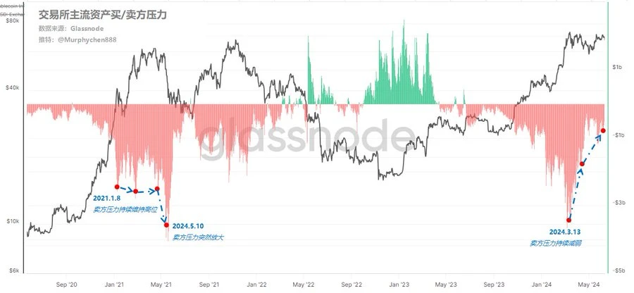
From the above figure, we can see that during the period of 2021.1.8-2024.5.10, the seller pressure of the exchange continued to remain high, and suddenly amplified as the price rose weakly (5.19 event), which was a signal that the bull market had peaked. In this cycle, as the price continued to rise, the seller pressure peaked on 2024.3.13, and then did not continue to remain high, but weakened rapidly . Combined with the analysis of the exchange flow potential in the previous tweet, the current exchange is in a low liquidity state, whether it is #BTC または #ETH .
Combining these data together, we can draw a conclusion that the current market meets the condition that chips in the low zone do not want to be sold.
2. Have you sold short-term high-priced stocks at a loss?
We introduce the Bitcoin Sell-Side Risk Ratio as a risk management tool to assess market risk. The model is calculated by adding up all profits and losses realized on the chain and dividing it by the realized market value. Therefore, its essence is to compare the total dollar value spent by investors every day with the total realized market value.
When the value is close to the red line below ( low value ), it indicates that most #BTC are sold at a price relatively close to the cost, and the market has reached a certain degree of balance. This situation can also indicate that the profit and loss within the current price range has been exhausted and the market is in a low volatility environment.
When the value is close to the blue line below ( high values ), it indicates that investors are selling #BTC at high profits or losses relative to their cost basis. This situation may require the market to re-balance, and is usually accompanied by high volatility price movements.
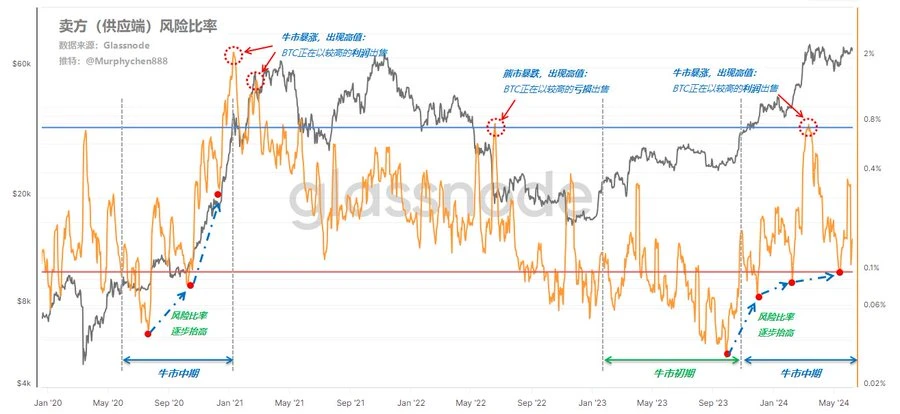
From the chart, we can see that high risk ratios often appear when the bull market soars or the bear market plummets, that is, investors either cash in high profits or sell at a loss. In the early stages of the bear market and the bull market, the number of low risk ratios is similar, indicating that high-cost investors are unwilling to sell at a loss at this time, and most of the BTC sold are short-term chips close to the cost price. This is also a market equilibrium period in a low volatility environment. For example, the current situation is similar.
As the bull market progresses, the risk ratio gradually increases, which means that the risk of sellers in the market is increasing. In the late stage of the bull market, it is almost impossible for the risk ratio to fall below the red line.
By observing this data, we can draw another conclusion, that is, the current market also meets the condition of not selling chips in the high zone.
結論
So far, the entire data reasoning logic has been explained. I think the current price range is likely to be the springboard before the main upward trend of this cycle begins. This conclusion is based on the current data, but the data will change, so there is no guarantee that the future situation will be 100% consistent with the analysis.
Is this the peak of the bull market? If this is possible, the following conditions must be met:
1. A large number of chips in the low zone left the market at the high zone, especially the chips in zones A and B formed in this cycle. They were not bought at the bottom of the bear market, so some of them are bound to be unwilling to ride the roller coaster of another cycle.
2. RP has multiple peaks, and the peaks are getting lower and lower, while RL begins to gradually increase.
3. The seller pressure in the exchange continues to remain high, and the exchange traffic potential begins to increase.
4. The sellers risk ratio shows consecutive high values, and the high points decrease step by step.
5. A black swan event occurs, which seriously deviates from market expectations.
The more of the above conditions are met, the more likely it is that the bull market is reaching its peak.
What I am talking about is a set of methodologies that are well-founded and can form a closed loop. Do not regard this as a prediction of the market or price. These models combine my long-term observation and tracking of data, as well as the accumulation of experience, and are one of the most intuitive and effective methods for judging the top of the bull market. If you also agree with this, you can use this as a reference, think carefully and draw your own conclusions.
This article is sourced from the internet: In-depth analysis: Is the current price range the springboard for the main upward trend of this cycle?
Original author: Jeff John Roberts, Fortune Magazine Original translation: Luffy, Foresight News On April 15, a dormant Bitcoin wallet revived after 14 years. The wallet’s owner sent 50 bitcoins to Coinbase, making more than $3 million in profits from the once-worthless coins. Such transactions are uncommon, but not unique. Early Bitcoin wallets resurrect almost weekly, raising the question of how many more presumed lost coins could be put back into circulation. A new investigation by Fortune and Chainalysis offers some insights. Chart showing the number of lost Bitcoins since 2018 As shown in the above figure, hundreds of thousands of lost Bitcoins (which Chainalysis defines as Bitcoins that have not moved since 2014) have returned to circulation over the past few years. The figure shows the net change in the…