The art of trading: sharing the application of technical indicators
It is not difficult to know, but it is not easy to do. For investment in the secondary market, everyone knows that you cannot be greedy, nor can you chase the rise and sell the fall, but how many people can control their hands to achieve unity of knowledge and action? In the Tao Te Ching, Lao Tzu mentioned Tao, law, and art. Tao refers to rules, natural laws, and core concepts, law refers to methods, legal principles, and systems, and art refers to behavior and operating methods. Tao, law, and art are combined and regarded as important principles and guidelines for guiding peoples lives and social development.
For the secondary market, we can also divide investment into Tao, Fa and Shu, and none of the three can be missing.
Tao: represents investment philosophy and investment beliefs, that is, the direction, goals and values of investment. Including analysis of long-term market trends, macro conditions and fundamentals.
Law: represents the laws and rules of investment, including investment strategy, risk management, and asset allocation.
Techniques: Technical analysis, quantitative analysis, and trading psychology of investment
Today, this report will focus on the skills in trading. Its purpose is to share the application of technical indicators and technical analysis in actual combat. For most people, there is no need to learn many unconventional technical indicators, because technical indicators are lagging and cannot directly make profits. This report will share commonly used technical indicator methods to let more people know the significance of technical analysis.
Disclaimer: The currencies and indicators mentioned in this report do not constitute investment advice and are for learning purposes only. The investment advice and indicator usage mentioned are not applicable to all currencies and products. Blockchain is extremely risky and you may lose all your capital. Please do your own research.
The article mainly includes:
1. Explanation and application of MA and MACD indicators
2. Interpretation and application of Boll and RSI indicators
3. Flag-shaped finishing variations
IV. Conclusion
1. Explanation and application of MA moving average indicator
MA indicator, also known as Moving Average, calculates the average price within a number. For example, MA 5 represents the average price of candlesticks in 5 time periods (including the current one), whether it is minute level, hour level, or day level. The smaller the MA number, the more sensitive the fluctuation is, and the more focused it is on short-term fluctuations. On the contrary, the larger the MA number, the slower the fluctuation is, and the more focused it is on long-term fluctuations.
The MA numbers are set according to the users preferences. Here I share two of my commonly used MA trading methods, namely Vegas Channel and Squeeze Channel.
Vegas Pass
The simplified explanation of Vegas Channel is to use the 144 and 169 moving averages to determine the medium and long-term trends. This method is not suitable for periods below 15 minutes, but is suitable for periods above 1 hour.
Why use these two moving averages?
If we observe carefully, we can see that 144 and 169 are the squares of 12 and 13 respectively. The principle implies Ganns square theory and Fibonacci sequence. That is, the number 144 comes from Ganns square theory, and the number 169 is the square of the Fibonacci sequence number 13. The combination of the two can achieve better application results in actual combat.
Explanation:
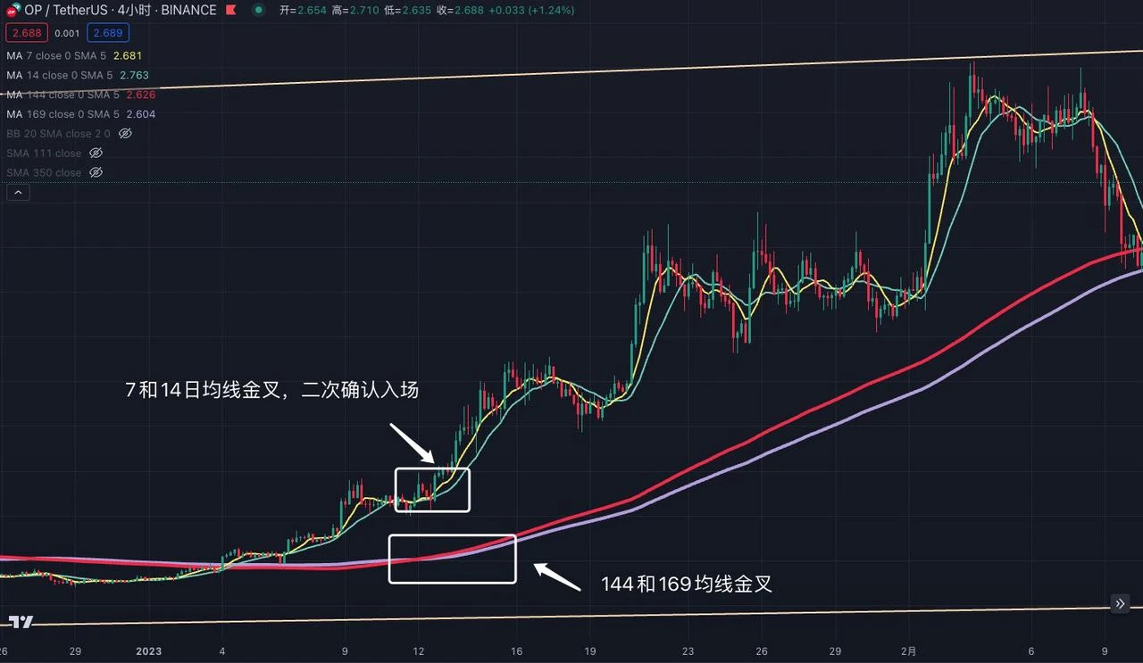
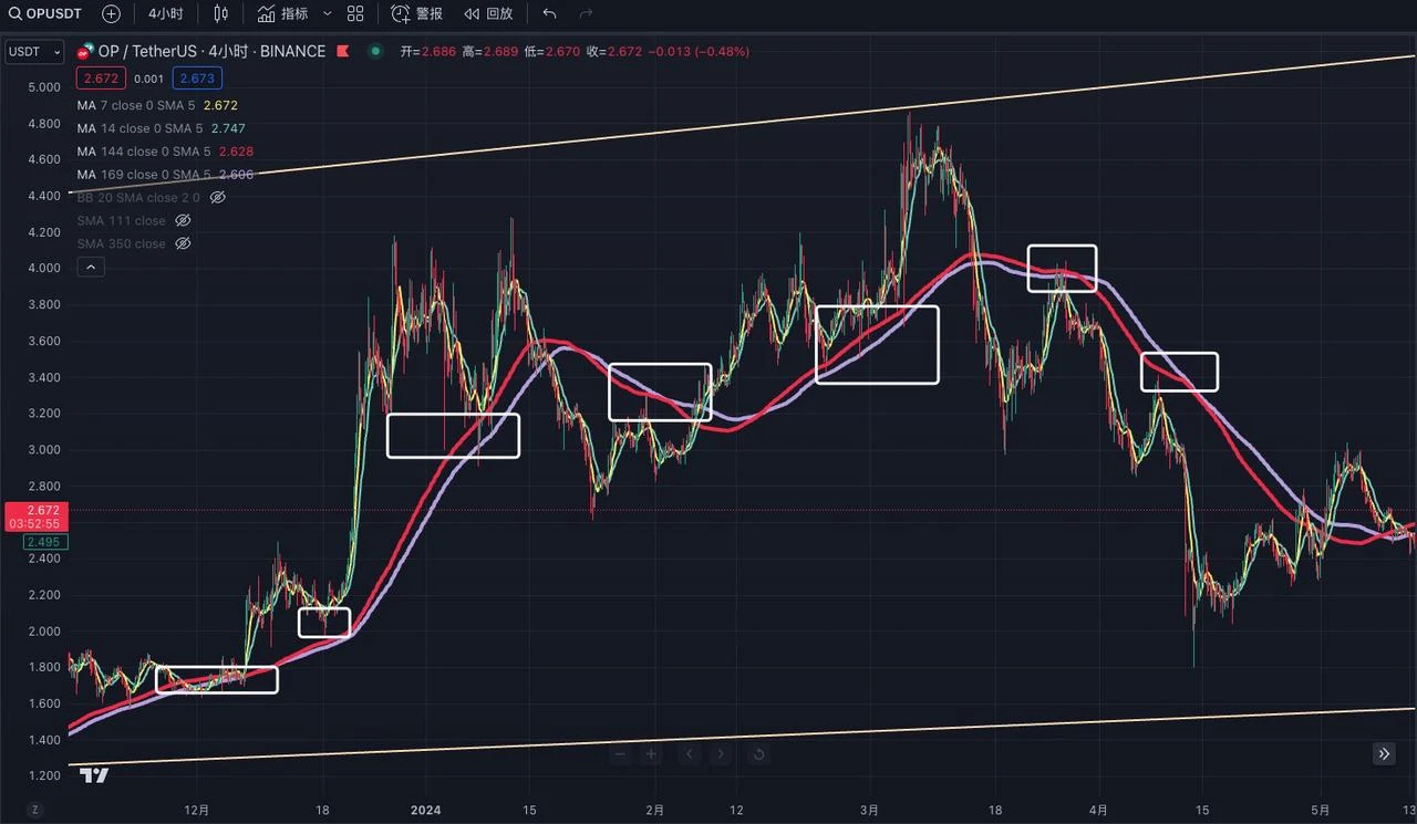
Taking the four-hour trend of OP as an example, we found that when the 144-day moving average crosses the 169-day moving average, a golden cross is formed (the golden cross represents the 144 moving average crossing the 169 moving average), which means a medium- to long-term bullish trend, and you can try to enter the market. When the price reaches the top, the 144 moving average crosses the 169 moving average, forming a death cross (the death cross represents the 144 moving average crossing the 169 moving average), then you should exit the market and wait and see in the medium- to long-term.
Someone may ask, what you said is too absolute, how do you explain the golden cross and dead cross before the sideways movement? You are just gambling!
My suggestion here is that since the 144-day moving average and the 169-day moving average cannot determine the short-term trend and have a strong lag, the 7-day and 14-day moving averages can be added on this basis to assist in determining the short-term trend. Lets zoom in on the trend of OP, use the large-scale MA moving average to determine the medium- and long-term market changes, and then use the small-scale MA moving average golden cross for secondary confirmation, so that the certainty can be maximized.
Vegas Channel is used to judge the medium and long-term trend. Due to the lag of Vegas Channel, it still needs to be verified with short-term moving average. A strong market must have the 144 and 169 moving averages rising. If the price is sideways near the 144 and 169 moving averages, it means that the short-term market is weak and it is not suitable to enter the market. At the same time, the 144 and 169 moving averages have good support and pressure effects, which are suitable for ultra-short-term oversold rebound operations.
Squeeze Channel
The squeeze channel mainly comes from the squeeze theorem in mathematical calculus. Its simplified explanation is that if a function is sandwiched by two other functions near a certain point, and the limits of these two functions are the same, then the limits of this function will also tend to the same value.
In secondary market transactions, we can also use a similar squeeze theorem model. We can simplify two moving averages, namely the 111 and 350 moving averages. Since the 350 moving average has a longer period, it is recommended to use it in short-term trading.
Why these two moving averages?
When we divide the 350 moving average by the 111 moving average, we get a number that is closest to pi, which is 3.15, or when we divide 350 by 3.14, the closest number we get is 111.
Example explanation:
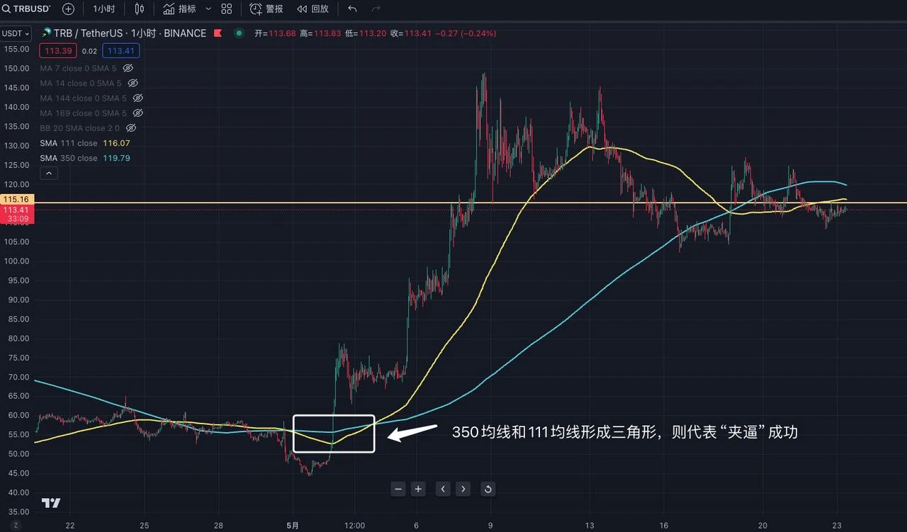
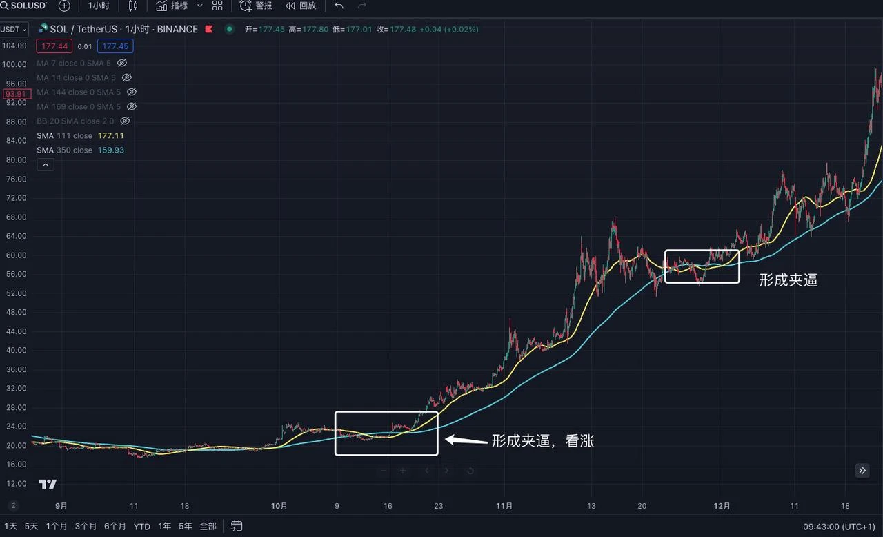
Lets take the 1-hour trend of TRB as an example. When the blue line (350) moving average is on the top and the yellow line (111) moving average is on the bottom, forming a triangle shape, it means that the squeeze is successful. After the success, the subsequent trend is bullish. However, it should be noted that for a correct squeeze pattern, the 111 moving average must cross the 350 moving average. If only one side crosses, it is not established.
This channel is applicable to the 1-hour and 4-hour levels, but its accuracy is average. However, once successful, the subsequent trend will be a super-large-scale market, so when a squeeze pattern appears, you can pay more attention and focus. We can also use other technical indicators to assist in judgment.
MACD (Moving Average Convergence Divergence)
MACD (Moving Average Convergence and Divergence) is the most commonly used technical indicator in trading. The core of the indicator is to analyze the changes in price momentum by comparing the moving averages of different periods, thereby providing buy and sell signals. MACD is mainly divided into three types: zero line, MACD line, and signal line, and mainly looks at three changes.
Three variations of MACD:
1. MACD line and signal line crossover:
-
Buy signal: When the MACD line (blue) crosses the signal line (yellow) from below, it means that the market momentum turns positive and you can consider buying long positions.
-
Sell signal: When the MACD line (blue) crosses the signal line (yellow) from above, it means that the market momentum turns negative and you can consider selling.
2. The relationship between the MACD line and the zero line:
-
Above the zero line: When the MACD line is above the zero line, it means that the short-term average is higher than the long-term average and the market is in an upward trend.
-
Below the zero line: When the MACD line is below the zero line, it means that the short-term average is lower than the long-term average and the market is in a downtrend.
3. Changes in the histogram:
-
The histogram changes from negative to positive: When the histogram changes from negative to positive, it means that the MACD line is above the signal line, the momentum is increasing, and it is a buy signal
-
The histogram changes from positive to negative: When the histogram changes from positive to negative, it means that the MACD line is below the signal line, the momentum is weakening, and it is a sell signal
Example explanation:
Lets take ETHs 4-hour trend as an example. When the MACD line crosses the signal line, it means the market is bullish, and when the signal line crosses the MACD line, it means the market is bearish. At the same time, MACD is applicable to all time periods, whether long-term or short-term, whether 1 minute or weekly.
Advanced Use of MACD and MA
In addition to the basic usage of MACD and MA, it is far from enough to just learn these. After all, the usage of these technical indicators can be queried through public information. Many major players and dealers will also deliberately create fake trends through this point, making you think that it will be too late if you dont buy now. In fact, it is a trick to trick you into buying.
How to prevent and identify these “fake trends”?
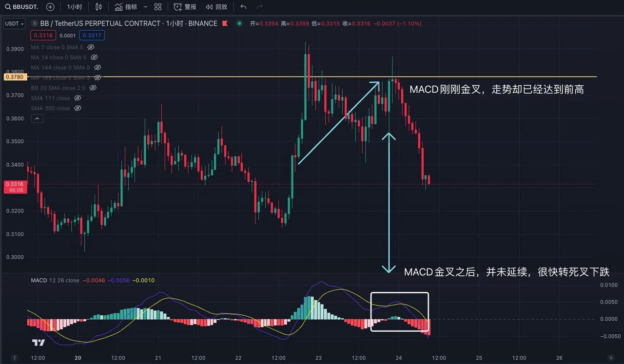
The fake trend is mainly to guide newcomers into the market through the MACD golden cross. Take the 15-minute trend of BB as an example. When the 15-minute trend breaks through the new high, it turns to fall rapidly, and MACD enters a dead cross, which means that a callback has started. However, during the callback, its trend is recovering rapidly, even approaching the previous high, but at this time MACD has just started a golden cross. We can understand this trend as willing but not strong enough, that is, the price has rebounded to the previous high, but MACD has just crossed. More than 80% of the results of this trend will be the same as this picture, and it will become soft after a while.
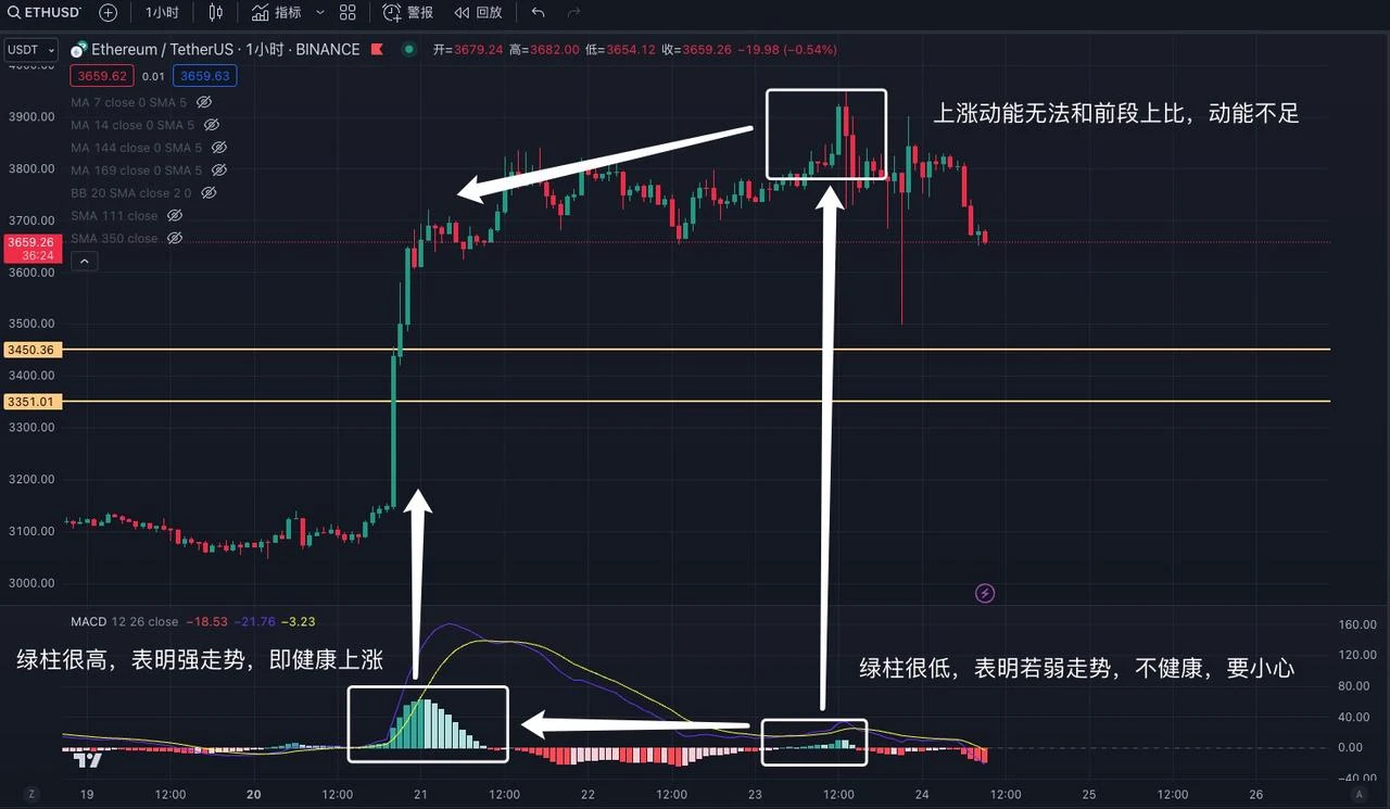
Lets take ETHs 1-hour trend as an example. MACD golden cross, green column rises sharply, and the price follows the rise. This rise is a high-quality increase, which means that you can enter the market to follow up. Then the price enters the sideways adjustment stage, and MACD turns into a dead cross. After the adjustment, MACD enters the golden cross, but the increase and trend are not continued like the previous golden cross, but are unable to rise, and the MACD volume column is not in a state of continuous strengthening. This holding a breath state is very dangerous. Although MACD golden cross, the strength is not strong, and the longer this state lasts, the more dangerous it is. When the price breaks through a new high and MACD does not have a new high, we call it top divergence, which is a strong sell signal. Similarly, when the price breaks through a new low and MACD does not have a new low, we call it bottom divergence, which is also a buy signal.
2. Interpretation and application of BOLL and RSI indicators
BOLL (Bollinger Bands)
BOLL is mainly a very simple and practical technical analysis indicator designed by John Bollinger, a US stock analyst, based on the principle of standard deviation in statistics. I personally think that it is very useful in the secondary trading of blockchain. BOLL is composed of three lines: upper, middle and lower, also called upper rail, middle rail and lower rail. The upper, middle and lower lines of the Bollinger Bands respectively mean pressure and support. When several reach the upper rail of the Bollinger Bands, they will be pulled back due to pressure. When they reach the lower rail of the Bollinger Bands, they will be pulled up due to support. When the stock price rises above the upper rail of the Bollinger Bands, it means overbought, there is a possibility of a callback, and it also means that the current stock is very strong. On the contrary, when the stock price falls below the lower rail of the Bollinger Bands, it means oversold, and it also means that the market is extremely weak. When the stock price falls from the upper rail of the Bollinger Bands to the middle rail, the middle rail plays a supporting role. If it falls through the middle rail, it becomes a pressure level. When the stock price rises from the lower rail of the Bollinger Bands to the middle rail, it also faces pressure. Breaking through the middle rail and standing firm means that the pressure level turns into a support level.
Here are 10 golden rules of Bollinger Bands that are important to remember:
1. When the price breaks out of the upper track, beware of a pullback. 2. When the price falls out of the lower track, beware of a pullback. 3. Strong market conditions are always above the middle track.
4. Weak market conditions are always below the middle track 5. Narrowing of the upper and lower tracks hides sudden changes 6. The larger the opening, the greater the market momentum
7. The middle line indicates the trend direction 8. The sudden closing of the channel indicates a reversal 9. The sudden opening of the channel indicates that consolidation is no longer
10. The longer the channel narrows, the smaller the opening will be, and the more obvious and drastic the changes in the future market will be.
Example explanation:
Lets take the one-hour trend of BTC as an example. BOLL is mainly divided into three lines, namely the upper track, the middle track, and the lower track. When the price exceeds the upper track, it means overbought, and the probability of a pullback is high. When the price falls below the lower track, it means oversold, and the probability of a pullback is high.
Lets take the trend of TRB for 1 hour as an example. When the BOLL band narrows, it means that there will be extreme market conditions. However, BOLL cannot accurately determine the specific direction and needs other indicators to assist in judgment. The longer the narrowing time, the shorter the BOLL band, which means the more intense the future market conditions will be. At the same time, in a strong rising market, BOLL will rise slowly along the middle track, while in a super strong market, BOLL will continue to rise above the upper track. On the contrary, in a weak market, BOLL will fall along the middle track, and at this time the middle track will turn from a support position to a pressure position. In a super weak market, BOLL will continue to fall above the lower track.
RSI (Relative Strength Index)
RSI (Relative Strength Index) is based on the principle of calculating the amplitude of stock price fluctuations to infer the strength of market movement trends, and predict the continuation or reversal of trends. The value of RSI fluctuates from 0 to 100, which means that the price will not exceed this range no matter what. We can simplify it to understand that when RSI reaches 70, it means that the market is overbought and the risk of callback increases, and when RSI falls below 30, it means that the market is oversold and may rise.
Example explanation:
Lets take the 1-hour trend of BTC as an example. When RSI falls below 30, it means that it needs to go sideways and pull back. However, this pullback is not absolute. It only means that the market is very weak and cannot be used as a direct basis for buying. Secondly, when RSI breaks through 70, it means it is overbought and there may be a risk of a pullback. But this still cannot be used as a basis for buying and selling, it can only be used as an auxiliary judgment. Note: In extreme market conditions, RSI can reach 99 or 1, so do not use RSI as the main basis for judgment.
Lets take the 4-hour trend of EDU as an example. After RSI broke through 70, it continued to rise and finally reached 99. Therefore, we cannot use the method of buying at 30 and selling at 70. We need to judge the nature of the stock/coin, whether it is a small market value, MEME-type coin, or a highly controlled coin. Compared with blue-chip coins, the RSI judgment of other small coins may need to be raised to the range of 90 and 10, rather than 30 and 70. This requires your own judgment.
3. Flag-shaped finishing variations
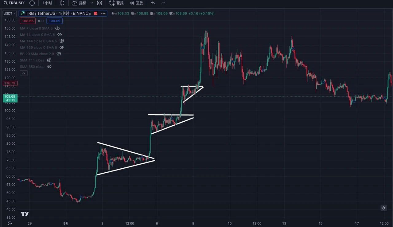
Flag consolidation is also called triangle consolidation. This consolidation is not judged by indicators, but by the trend changes on the K-line. We can summarize it into 16 common basic types of changes. If you see a similar trend, you can buy. Generally, the success rate is very high and the follow-up is bullish. However, there are times of failure. It is recommended to buy at the low point of the flag. When the triangle area is broken through and the price rises, the breakthrough area becomes a support position. If it falls later, you can intervene near the support.
Example explanation:
Lets take the 15-minute trend of APT as an example. Its trend is a standard reproduction of the third and tenth trends in the above figure. However, it should be noted that this is only a successful case. Many major players and dealers will deliberately make similar graphics to deceive people into getting on board. We need to be careful to identify or stop losses in time.
Let’s take the 1-hour trend of TRB as an example. We observed that TRB used the three-week flag consolidation trend to achieve a three-fold increase in a week. So when we see a similar trend in the market again, we can draw it ourselves for verification.
IV. Conclusion
As the saying goes, Tao, Method and Art are all indispensable in trading. This report only focuses on the art in the trading process. It is far from enough to just learn and master the use of technical indicators. There are many pitfalls in the market, and every three months or so, the market trend, rising and falling methods will be greatly updated, so you need to keep looking and summarizing, and observe the subtle changes in the market.
People are alive, but indicators are dead. The existence of technical indicators is to help us judge transactions after sufficient understanding and risk control, and cannot be used directly to make profits. After all, all technical indicators are lagging and cannot be 100% accurate. Only after we have sufficient understanding and risk control can we assist investment, otherwise it is gambling.
At the same time, all technical indicators are not as simple as described in the report. Each indicator has different variations and methodologies. If you study carefully, you can study each indicator for several years, so the article does not mention all the variations and methods. At the same time, everyone has different styles, and the use of indicators is also different. You need to gradually adjust according to your own trading style.
Finally, I would like to reiterate that the currencies and indicators mentioned in this report do not constitute investment advice and are only for learning purposes. The investment advice and indicator usage mentioned are not applicable to all currencies and products. Blockchain is extremely risky and you may lose all your capital. Please do your own research.
This article is sourced from the internet: The art of trading: sharing the application of technical indicators
Related: SignalPlus Volatility Column (20240702): Can there be a rebound in July?
The past month has been a heavy loss for Bitcoin investors. The price of the currency has continued to decline since the high of nearly 72,000 at the beginning of last month, and once fell below the 60,000 mark. As the beginning of July, the funds of ETFs have gradually resumed positive inflows, and the price of BTC has also taken advantage of the trend to get rid of the 60,000-62,000 range at the end of last month, challenging 63,200 US dollars twice. This will be the key to witness whether BTC can continue to recover its lost ground, and investors have high hopes for this. But if the challenge fails, BTC is likely to repeat the tragedy of June and fall below 61,000 again. At the same time, Federal…

