Fed'in politika kumarı: Sağlam verilerin ardındaki ekonomik bölünmeler
Orijinal yazar: ◢ J◎e McCann
Orijinal çeviri: TechFlow
(The following was originally published in the Macro section of our August Asymmetric Market Update™️, which you can subscribe to for free here)
In our previous macro commentaries , we looked at key topics related to potential market impacts, the global landscape, and how to navigate these complex times.
We discussed (a month before the banking panic surfaced and frightened the markets) the risks facing small and medium-sized banks due to the uneven distribution of excess reserves, despite the large amount of reserves in the system.
We have repeatedly mentioned mixed economic data and discussed the concept of the “duck economy”: everything seems to be going well on the surface, but there is a lot going on in the dark. Beauty is in the eye of the beholder. Despite strong headline economic data, if you dig deeper you can weave any bullish or bearish narrative you prefer.
We also analyzed how the Magnificent Seven compares to the rest of the stock market. Similar to the economic data, the stock indexes performed well, but a deeper look revealed that the Magnificent Seven stocks performed extremely well while the rest of the market was flat or even declining.
In this issue of Asymmetric Macro, we will tie together all of the concepts discussed previously into a coherent story, starting and ending with the theory of monetary policy itself.
Monetary Policy
For any dataset, you need to define the underlying distribution before you can do meaningful analysis. To simplify the description, we will use three basic distributions. While none of them are perfect, the main points will be clear. Headline economic data is used to describe the overall economy or the average economy, which is conceptually sound because you cannot tailor economic policy to each individual (to take an extreme example). From many perspectives, this is unfair and unfeasible in reality. Therefore, we use aggregate data to describe the state of the economy and thus determine the most appropriate monetary policy for that aggregate data. Lets first understand the three types of distributions to describe the underlying population.
Note: We are not writing a PhD thesis. This discussion is not complete or foolproof because we have limited space. We have woven a story that is very relevant to the current state of the world and economic policy. So rather than nitpicking over trivial details, let’s consider the concepts and their potential impact at a thought level.
Evenly distributed
Figure: Uniform distribution
As you can see, a uniform distribution is when every observation (in this case, the socioeconomic status of an individual) is the same. A uniform distribution would be the communist ideal. A uniform distribution would also produce the best data set to conduct monetary policy analysis on. If everyone was in the same position, there would be no variance, so the “average data” would represent everyone perfectly. Therefore, monetary policy based on this data would be perfect (assuming economic theory is valid and applied strictly as per the rules). We know this is not the case. The communist ideal is often difficult to achieve.
normal distribution
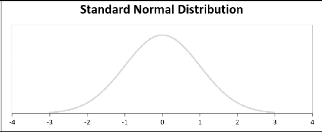
Figure: Normal distribution
In a normal distribution, the mean, median, and mode are the same. Exactly half of the observations (in this case, the socioeconomic status of individuals) are to the right of the center, and the other half are to the left of the center. The distribution implies that socioeconomic density is highest near the mean, with the number of privileged or disadvantaged individuals decreasing as deviations from the mean increase. Even average data can work well with a dominant middle class and a reasonable distribution of wealth (the US was more balanced in the not-too-distant past than it is today). While its not perfect, the density is still concentrated around the mean, so monetary policy based on this data is reasonable because it captures the situation of most of the population (although monetary policy is not relevant at the ends of the population; in a normal distribution, thats a relatively small fraction).
Bimodal distribution
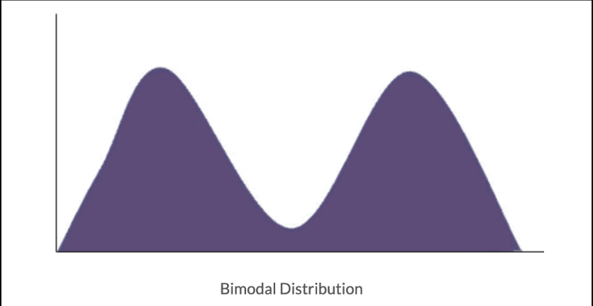
Figure: Bimodal distribution
A bimodal distribution is one in which there are two modes. In other words, the results of two differently distributed processes are combined and presented in one set of data.
This bimodal feature has been showing up a lot lately in all aspects of our world. Let’s look at some of the relevant examples we mentioned earlier.
Excess bank reserves are unevenly distributed
In Asymmetric’s February 2023 release, we noted: “While there is an abundance of excess reserves in the system, they are not evenly distributed. These reserves are concentrated in money center banks (such as JPMorgan Chase Co.)”
So, despite the fact that the aggregate amount of excess reserves was very ample, we had a banking crisis that led to the Fed having to set up an emergency funding facility to support many banks that did not have sufficient reserves. Several major banks had already collapsed before this facility was opened. Why did this come as a surprise to everyone? Because the excess reserves data is superficial data and does not take into account the actual distribution of these reserves. Many banks have no reserves, while some banks have most of the reserves. This is a bimodal distribution. The aggregate data alone does not accurately reflect the true situation in the banking industry. So the distribution here is crucial but has been ignored.
The uneven distribution of reserves and the subsequent emergency funding facilities resulted in weak banks having to pay large interest charges to maintain their balance sheets and grow deposits. Strong banks (like JPM) received significant interest income from their excess reserves. This is like a wealth transfer from the poor to the rich. One could argue that this is a penalty for poor management, and thats not wrong. But this still leaves you with a bimodal distribution going forward. And given the dynamics, this is becoming increasingly bimodal.
Small Businesses vs. Giant Companies
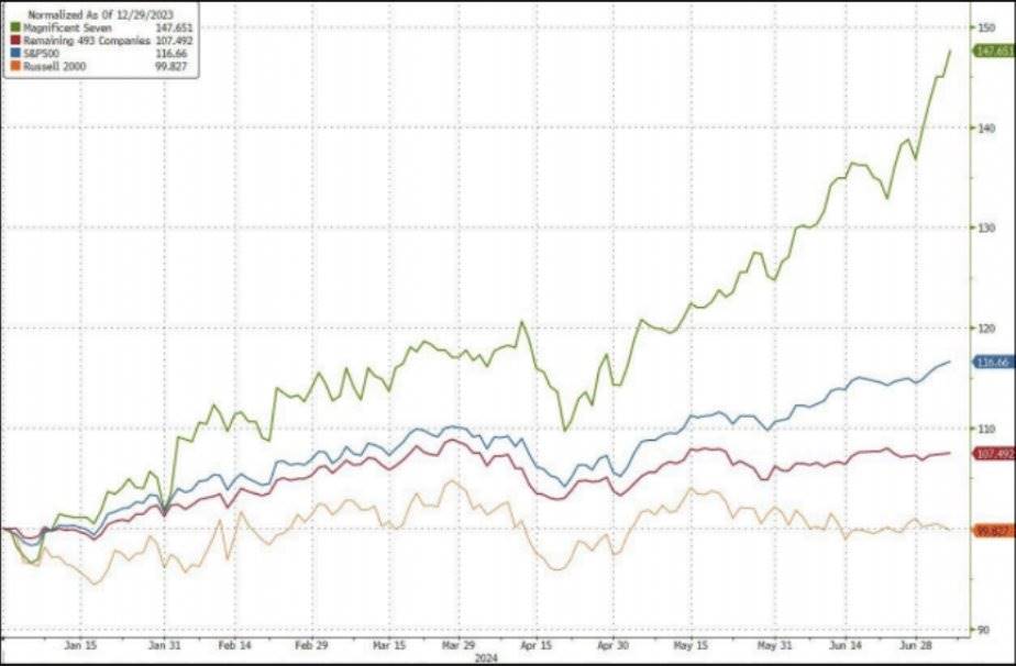
In Asymmetric ’s July 2024 update , we published the following chart:
Figure: The Magnificent Seven vs. 493 other companies, SP 500 and Russell 2000
Looking at the Magnificent Seven versus the rest of the stock market (particularly the Russell) also shows a somewhat bimodal distribution. You have a group of large companies that have outperformed, and then you have a group of smaller companies that havent been nearly as successful as these giants.
One could argue that this is a capitalist consequence of creative destruction, and that’s not wrong (we’ll ignore the impact of monopoly/oligopoly industries for this discussion). Regardless, given the current dynamics, this still leaves you with a bimodal distribution in the future that is still intensifying (or a series of monopolies at the boundary).
Some of these results can be attributed to the scalability of technology. Once you dominate a field, you drain business potential and capital away from your competitors. As a result, these large companies end up with a lot of cash and record profits. They buy back their shares and earn a lot of interest income on this cash. Smaller companies, on the other hand, are more heavily in debt (not rich) and have to pay a lot of interest to stay afloat. Its like a wealth transfer from the poor to the rich.
Socioeconomic distribution
We have chosen the chart below as a convenient example of a bimodal distribution in socioeconomic status. This dataset has two different modes, representing the fragmentation of society. Is it useful to look at the average credit score here? Not at all. This is exactly the point. We are used to looking at average data, but in a bimodal distribution this can be at best unhelpful and at best very harmful and misleading to the analysis.
Figure: Socioeconomic distribution of high credit scores
We can add more details around the distribution of personal savings, debt/credit service charges, etc., but we all know what it will show: a bimodal distribution. As the above example shows, those who pay high interest charges are facing huge difficulties. And those who have excess savings are enjoying the benefits of these high interest rates. Its like a wealth transfer from the poor to the rich.
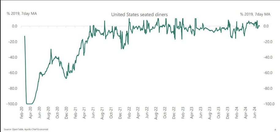
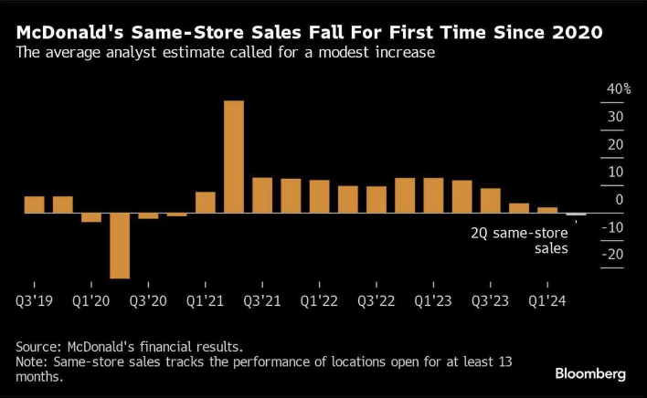
Photo: American diners
As the chart above shows, the wealthy are doing well.
McDonalds same-store sales decline
Those with less disposable income are worse off.
Bringing it all together
What do all three examples have in common? Paying and receiving interest have opposite results – the poor are getting poorer and the rich are getting richer. That is the core of the problem. Wealth and assets are being transferred from the weak to the strong.
Why does all this matter? Monetary policy is based on aggregate data. On average, everything looks good and stable. However, one mode in this distribution is experiencing severe pain. High interest rates benefit the other mode. So by keeping interest rates high and waiting for the average data to weaken, the Fed is actually squeezing the weaker group more instead of helping the stronger group. From this perspective, this approach is very distorted.
Why do wealth disparities continue to grow? Because the way monetary policy is implemented exacerbates wealth disparities. This is not a treatise on the virtues of wealth redistribution, but in many major areas of our economic life, wealth disparities will continue to grow until we have some kind of collapse, debt relief, or other tail event.
Sonuç olarak
In our view, the Fed should cut rates in July.
Employment has peaked and is declining significantly.
Inflation, at 2.5%, is falling rapidly and is expected to reach the 2% target by the end of the year.
Yet, real interest rates are currently 3%. In a steady-state, healthy economy, they have historically been around 1%.
So what is the Fed doing?
They are focusing on aggregate data and ignoring the underlying distribution.
This is where strategic errors occur.
The wealthy and cash-rich are enjoying higher interest income (not to mention assets near all-time highs). The cash-poor are being hammered by interest payments. Insensitive to, and even benefiting from, higher interest rates, the Federal Reserve is effectively waiting for lower socioeconomic groups to deteriorate further in order to bring the average down to its target. Sorry, poor people, youre getting the pain and little to no benefit.
If the Fed allows tight monetary policy to continue (thats their term), they will face serious employment problems and the hollowing out of small businesses. Once this happens, history shows that it is difficult to reverse. They face the risk of a hard landing.
Everything seems normal until things suddenly go wrong. Changes often come slowly, and then happen in an instant.
This article is sourced from the internet: The Fed’s policy gamble: Economic divisions behind solid data
Related: In-depth analysis: How much impact does mining cost have on the lower limit of BTC price?
Original author: Murphy, on-chain data analyst (X: @Murphychen 888) How much impact does mining cost have on the lower limit of BTC price? Some people have misunderstandings about whether mining costs affect BTC prices. They believe that in the current capital era, the proportion of BTC in the hands of miners in the entire circulation market is very small, so whether miners sell or not does not affect the price trend of BTC. Here I can talk about my personal opinion. First of all, the mining cost has no effect on the upper limit of BTCs price, which is beyond doubt; but it will greatly affect the lower limit of BTCs price . The logic behind this is not that miners will sell or not sell their chips when the…


