Interpretation von On-Chain-Daten: Warum weist ETH eine schlechte Leistung auf und wann wird es sich erholen?
Original author: Murphy (X: @Murphychen888 )

Detailed explanation of ETH chain data, here you go:
-
Why did ETH perform so poorly this round?
-
Is there still hope for ETH?
-
Under what circumstances can ETH catch up?
In response to the issues that you are concerned about, I will try to make some comparisons and analyses from the perspective of on-chain data, hoping to provide some reference for you. I will use the following 5 chapters to analyze and explain. If you can read it patiently, I believe you will gain something.
(1/5)
Maybe it’s because ETH’s performance has been “too outstanding” in recent times. More and more friends have left me messages, asking me to analyze some ETH’s on-chain data. Including this lecture in Shenzhen, after class, the most asked question among my friends was ETH.
Alas… What is ETHs merit that makes so many friends worry about it? When asked how ETH can get out of its decline, I usually answer jokingly: Unless Vitalik leaves with Satoshi Nakamoto and the Ethereum Foundation is dissolved… Of course, jokes aside, to analyze the specific reasons, we still have to start with valid data.
I believe that you have also seen many bloggers analyze the narrative ability, ecological construction, technical competition and other aspects of this round of ETH, so I will not repeat them here. In fact, whether the price is good or not, it all comes down to whether money is good or not. As long as it can get the attention and pursuit of funds, there is nothing that a big positive line cant solve.
Therefore, it is particularly important to determine whether ETH is being paid attention to by funds. I have two measurement criteria, one is the proportion of ETH traffic on exchanges , and the other is the overall activity on the chain ;
The so-called exchange traffic refers to the total amount of money transferred in and out of the exchange every day. The transfer in can be regarded as supply, and the transfer out as potential demand . When the traffic gets higher and higher, it at least shows one thing, that is, ETH is beginning to attract the attention of more funds!
In particular, we can use #BTC as a reference. After all, Bitcoins status in the world is irreplaceable. By observing the traffic share of ETH relative to BTC, we can clearly see the changes in capital preferences.
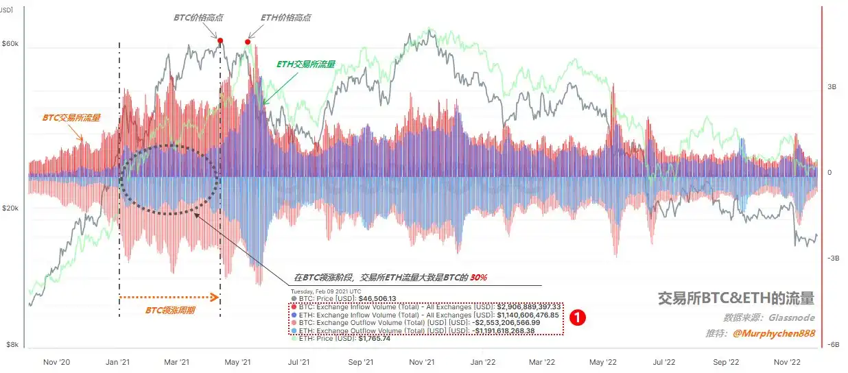
Figure 1 below is the flow data of BTC ETH on the exchange. In order to facilitate the following explanation, we first need to understand some key elements in the figure:
1. The gray and light green curves in the figure represent the prices of BTC and ETH respectively;
2. The red wavy line represents the inflow and flow of BTC in the exchange; the blue wavy line represents the flow of ETH in the exchange;
3. The area above the middle zero axis represents the inflow, and the area below the zero axis represents the outflow.
(Figure 1)
Let’s first look at the traffic performance of ETH in the last cycle:
BTC led the rally from January to April 2021, and almost all the funds in the market focused on BTC. For example, on February 9, which I captured (see mark 1 in Figure 1), BTC had an inflow of US$2.9 billion and an outflow of US$2.5 billion; ETH had an inflow of US$1.14 billion and an outflow of US$1.19 billion. At this time, ETHs exchange traffic was roughly 30% of BTCs.
(Figure 2)
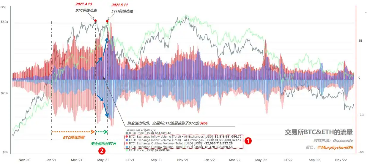
From April to May 2021, BTC began to pull back, while ETH began to catch up. We can see that the essence behind this is the change in capital preference. For example, on April 27, which I captured (see mark 1 in Figure 2), BTC had an inflow of US$2.8 billion and an outflow of US$2.7 billion; while ETH had an inflow of US$1.6 billion and an outflow of US$1.5 billion; in terms of flow share, it reached 50% of BTC.
Please note the causal relationship here. It is not because BTC has pulled back that ETH will necessarily rise. It is the push of funds that makes ETH perform strongly at this time. The increase in the proportion of traffic can precisely illustrate the spillover effect of funds (see mark 2 in Figure 2), and more and more people are beginning to focus on ETH. Therefore, ETH also reached its historical high of $4,172 for the first time one month after BTC reached its high price.

(Figure 3)
After May 21, due to the May 19 black swan incident, panic brought down the entire market, and the exchange traffic of BTC and ETH began to shrink at the same time, and the currency price also fell synchronously. At this time, we can find that even with the overall reduction, the proportion of ETHs traffic in the exchange has increased instead of decreased, and it can almost maintain the same scale as BTC, from the previous 50% to 100%! (See mark 1 in Figure 3)
This shows that at this time, market funds did not flow back to BTC due to panic, but were more firmly optimistic about ETH. This is also the fundamental reason why ETH could even go higher and more stable than BTC in the second top range of the last bull market.
(2/5)
I can sort it out. When BTC started in the last cycle, ETH traffic accounted for 30%; when it peaked and fell for the first time, ETH traffic accounted for 50%; when it peaked for the second time, it had reached 100%.
Let’s take a look at the flow performance of ETH in this round:
From October 2023 to March 2024, BTC led the rise in this cycle. Due to the expected hype of BlackRocks application for spot ETF, on-site funds also paid more attention to BTC.

(Figure 4)
From the day I captured on February 2 (see mark 1 in Figure 4), BTC had an inflow of US$3 billion and an outflow of US$2.8 billion; while ETH had an inflow of only US$440 million and an outflow of US$510 million; at this time, ETHs exchange flow was roughly only about 15% of BTC, which can be said to be pitifully small.
In March, the price of BTC broke through the historical high of $73,000. Although ETH also rose synchronously at this time, the exchange traffic of ETH did not improve significantly compared with BTC. As I took a screenshot on March 13 (see mark 2 in Figure 4), BTC had an inflow of 5.4 billion and an outflow of 4.9 billion; ETH had an inflow of 1.4 billion and an outflow of 1.3 billion. Even when the market was the most fomo, the exchange traffic of ETH was only about 25% of BTC.
Compared with the previous cycle on April 27, 2021 (see Figure 2 in 1/5), the ETH price was also around $2,600 (similar to now), but at that time ETHs traffic share had reached 50% of BTC, and then it reached the subsequent historical high of $4,172.
It is obvious that after BTC broke through its historical high in this cycle, funds did not overflow from BTC to ETH like in the previous cycle.
(Figure 5)
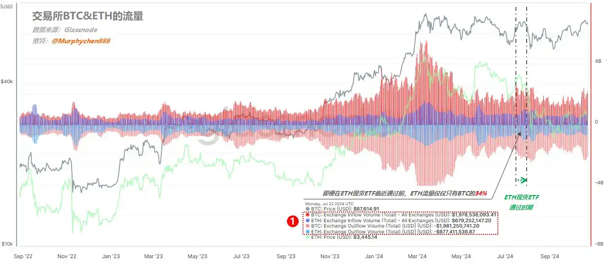
Even around the time when the ETH spot ETF was approved in July (as shown in Figure 5 above), ETH exchange traffic was only about 34% of BTC, which was completely different from the reasonable level of 50% in the previous cycle, not to mention that in the second peak area, ETH traffic even reached 100% of BTC at one point (see Figure 3 in 1/5).
It was also because of seeing this data that I made up my mind to exchange my ETH for BTC on the day the ETH spot ETF was passed.
(Figure 6)
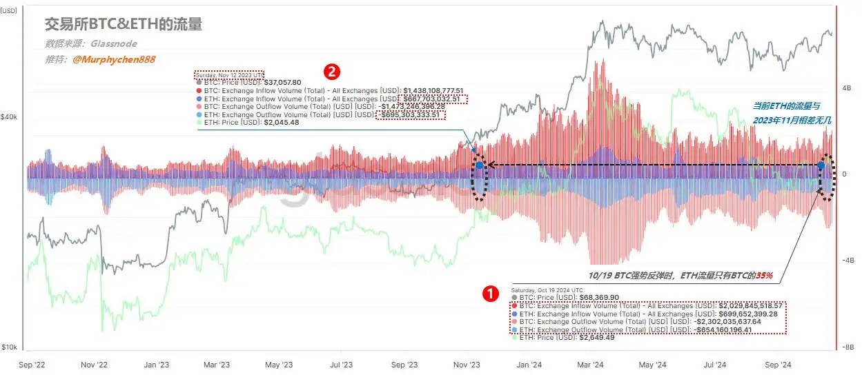
When BTC rebounded to $68,000 on October 19, BTC had an inflow of 2 billion and an outflow of 2.3 billion; ETH had an inflow of 700 million and an outflow of 650 million; ETHs exchange flow also remained at around 35% of BTC (see mark 1 in Figure 6).
The figures of 700 million inflows and 650 million outflows are almost equivalent to the scale at the beginning of the bull market in November 2023 (see mark 2 in Figure 6).
It can be seen that from the beginning of this cycle to now, funds’ attention to ETH has always been lukewarm. It’s not that there is no attention, but it is much worse than the previous round. Even if there is an epic benefit from the spot ETF, it cannot arouse greater interest in funds. Why is this?
(3/5)
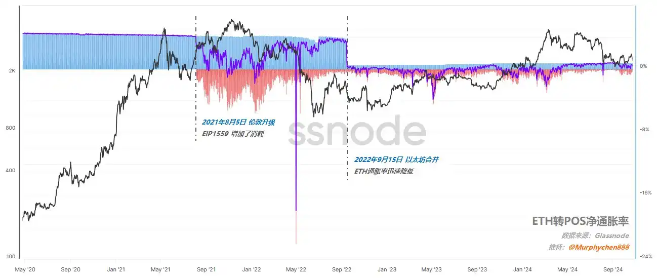
We all know that in 2021, ETHs consensus mechanism switched from PoW (Proof of Work) to PoS (Proof of Stake), a process called Ethereum Merge. The whole process includes 2 important stages (as shown in Figure 7):
(Figure 7)
1. On August 5, 2021, the London upgrade mainly introduced the EIP-1559 proposal, changed the transaction fee structure, and reduced the inflation of ETH supply in preparation for the merger.
2. On September 15, 2022, the ETH mainnet completed the transition from PoW to PoS. From then on, the generation of blocks will be the responsibility of validators rather than miners.
There are different opinions on whether the transition from PoW to PoS is good or bad. For example, Ni Da @Phyrex_Ni also expressed his support for the transition to PoS yesterday, believing that it would be unwise for ETH to continue to stay in the PoW track and compete with BTC for power. Jason brother @jason_chen wrote an extremely wonderful article on October 24, in which he analyzed the internal and external factors of Ethereums current deadlock by citing the business cases of Alibaba and Pinduoduo.
But no matter how we discuss good and bad, money seems to have voted with its feet.
(Figure 8)
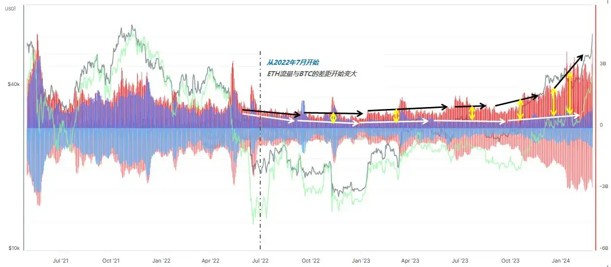
As shown in Figure 8, starting from July 2022, the gap between the proportion of ETH exchange traffic and BTC began to gradually widen, and this situation has continued to this day. This shows that from this period onwards, funds began to gradually withdraw from ETH. Coincidentally, this start time was just before the Ethereum mainnet completed the transition from PoW to PoS.
It is not the ETF that makes funds prefer BTC. After all, the ETF of ETH was approved shortly after the ETF of BTC was approved. But is it because of the transition from PoW to PoS? I am not sure.
But in any case, at least one thing is certain, that is, if Ethereum continues to maintain the status quo (including internal and external), then even with the support of ETF, it will be difficult to obtain more than 50% or more of the BTC exchange traffic. Because after this round of fomo sentiment in March this year, the market has already rehearsed it.
(4/5)
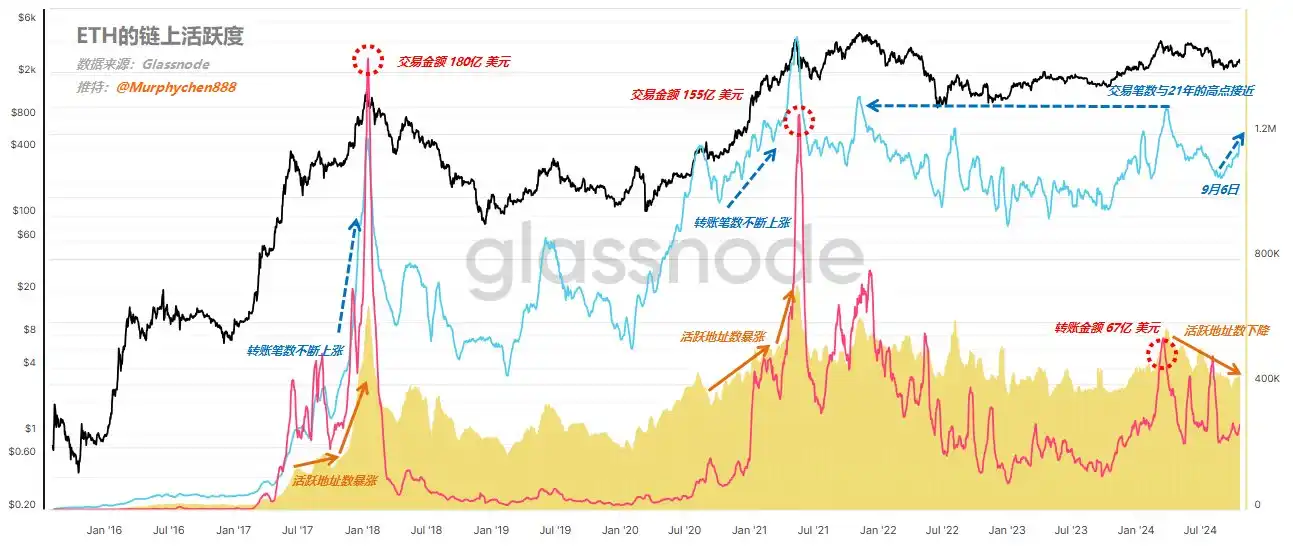
After looking at the exchange traffic data, let’s take a look at ETH’s on-chain activity data. I define the integration of three dimensions of data as on-chain activity, including:
1. Number of active addresses (yellow waveform in the figure)
2. Number of transfers (blue line in the figure)
3. Transaction amount, in US dollars (red line in the figure)
(Figure 9)
From Figure 9, we can clearly see that the strong ETH price in 2017-2018 and 2020-21 is due to the surge in the number of active addresses, while the number of transactions initiated and the amount of transfers converted into US dollars are rising simultaneously. In January 2018 and May 2021, the amount of ETH on-chain transfers reached a record high of US$18 billion and US$15.5 billion, respectively.
In this cycle, the number of active ETH addresses has been declining since March. Although the number of transactions in March was close to the high point in 2021, the transfer amount was only 6.7 billion US dollars, indicating that compared with the previous round, ETH has also lost the participation of big funds in on-chain transactions. Its volume is not even half of the high point in 2021. The number of transactions is close, but the scale of funds is relatively small.
(5/5)
Under what circumstances can ETH catch up?
The data I listed above are all objective facts, but it does not mean that I am completely pessimistic about ETH subjectively. However, I personally think that at least now is not a good time to get involved in ETH.
Whether ETH can catch up with the rise of BTC after it starts, we only need to look at the degree of capital preference, and at the same time verify it with the comprehensive activity data on the chain, and we can basically make a pretty accurate judgment.
When is it more appropriate to intervene? My principle is:
1. ETH’s exchange traffic to BTC reaches 50% or more (currently 35%)
2. Maybe after 50%, the price of ETH will have gone up, but it will definitely not be the highest. For me, I need to confirm the trend first and then execute the strategy.
3. The number of active addresses on the chain reflects the prosperity of the ETH ecosystem to a certain extent, and it is necessary to take a continuous upward trend;
4. The number of transfers and transaction amounts should be magnified simultaneously, especially the transaction amount, which is an important basis for measuring whether large funds are involved.
This article is sourced from the internet: Interpretation of on-chain data: Why is ETH performing poorly and when will it rebound?
Verwandt: Wird Solana beim „Netzwerkausbau“ in die Fußstapfen von Ethereum treten?
Entscheidende Phase für Solana Originalautor: Ignas, DeFi-Analyst Originalübersetzung: Ismay, BlockBeats Solana wechselt von der Skalierung einer monolithischen Blockchain zu einem modularen Ansatz, ein Narrativ, das derzeit diskutiert wird. Welches Framework wird sich durchsetzen? Wird der Name „Network Extensions“ in der breiteren Krypto-Community Akzeptanz finden? Oder werden Layer-2-Frameworks wie Ethereum den Markt erobern? Dies ist wichtig, denn wenn Solana das monolithische Narrativ aufgibt, wird es in eine peinliche Situation ähnlich der von Ethereum in diesem Zyklus geraten: In diesem Bullenmarkt ist $ETH zwischen $BTC und $SOL gefangen. BTC ist eine bessere Währung für weniger konservative Anleger und Institutionen, während SOL eine schnellere, einfachere und kostengünstigere Smart-Contract-Plattform mit größerem Wachstumspotenzial als ETH ist. Wenn Solanas Narrativ sich von einem monolithischen Modell abwendet und sich der Verwendung von L2 zuwendet…


👍